
Thursday, July 25, 2013
Food Truck Map Rejected logo :(

Thursday, November 8, 2012
Does your carpet match your Draper?

Okay, I know I have been negligent of my blog as of late. But for those of you who are fans of me and the show MadMen here is a little Don Draper tribute. Trying to draw more celebrities and build up a portfolio to send to potential editorial illustration jobs. Enjoy!
Tuesday, October 16, 2012
Hello All,
Just wanted to show you a little brochure I've almost completed for the Monterey County Water Re-Use Council. Not only does his brochure explain the procedure by which to obtain re-usable water, it also exclaims the benefits of using said water and has graphics drawn by IsaacsInk! It is awesome and should be available soon to Monterey County Residents! If you or your company need any brochures for upcoming events or advertising give us a call.


Just wanted to show you a little brochure I've almost completed for the Monterey County Water Re-Use Council. Not only does his brochure explain the procedure by which to obtain re-usable water, it also exclaims the benefits of using said water and has graphics drawn by IsaacsInk! It is awesome and should be available soon to Monterey County Residents! If you or your company need any brochures for upcoming events or advertising give us a call.


Thanks for reading and we hope to hear from you!
Friday, October 12, 2012
Logo Design
Hello Readers!
So I was asked to do a logo with the following specs:
So informative, right? Now here is where I and you should ask all sorts of other questions like: Who is your audience? What does the S and B stand for? What kind of Connection, human, electrical, mechanical? And anything else that pops into your head. And based on these answers maybe even question them further. The more understanding you have about your client the better and sometimes its not as easy as looking them up on the Internet. In this specific situation I was contracted through another company who dealt primarily with small local businesses. So I thought this must be a logo for them. So I forgot one of the first rules of design which is, "Do your research!" And now I will briefly and possibly unwillingly drag you down the path of what I actually did.
First idea:
Legos!


So I was asked to do a logo with the following specs:
- Theme of Connection
- Letters S and B, in that order.
- Clean
So informative, right? Now here is where I and you should ask all sorts of other questions like: Who is your audience? What does the S and B stand for? What kind of Connection, human, electrical, mechanical? And anything else that pops into your head. And based on these answers maybe even question them further. The more understanding you have about your client the better and sometimes its not as easy as looking them up on the Internet. In this specific situation I was contracted through another company who dealt primarily with small local businesses. So I thought this must be a logo for them. So I forgot one of the first rules of design which is, "Do your research!" And now I will briefly and possibly unwillingly drag you down the path of what I actually did.
First idea:
Legos!

I decided to go with a Lego inspired typeface, which definitely, at least in my head, addressed the theme of Connection and was surprisingly versatile in creating letters.

However I noticed 3 things almost immediately. It was definitely not clean. It as pretty hard to read and when I tried to do the two letters I had to incorporate it looked downright ugly.
This didn't however discourage me from the Lego theme. Maybe it is my love for the tiny imagination building toys or pure stubbornness but I continued with the Lego theme just at a 3/4 view.
So you might be thinking, "Yeesh! Really this guy designs stuff professionally?" And honestly looking back at this, I too am kind of wondering, 'what made me believe this could work?' But let me get on my high horse and say, design is an iterative process and so is creativity. Every idea or sketch can foster another idea or thought and if we don't 'put down' the crappy ones, the good ones, right behind them, may never come up. So back to the path I'm dragging you on. This one was okay, still connected, slightly more legible but again, clean, it was not. So with a little tweaking the next more amazing iteration was born!
Yeah, yeah, I know not much different, but if you've read this far, it got you to continue reading, right? Hello...? Anyway, with a little contrast in colors and the extrication of those now really annoying Lego bumps, we have a decent looking logo. I might have submitted this too had I not had a bit of an epiphany. I thought to myself, 'Self, it looks a little unbalanced as if the S will just fall right out,' and that was probably true. Without the Lego bumps holding everything together the piece would not work physically. Not to say that every Logo needs to respect the laws of physics but in this case I had a feeling it did. So this 'feeling' took me back to the sketchpad and I wound up changing the colors a bit, getting rid of the internal border and adding an offset external surrounding stroke and rotating the S, 90 degrees. With the following result:
Ta Dah! I liked it and I feel like I would have never come to this result without the trials and errors of the previous ones. I also felt like it addressed all the specs given to me by the client and I slapped a background on it and sent it off.
Turned out they went with another one of my ideas and not this one but hey, "thems is the breaks."
Thanks for reading!
Wednesday, October 10, 2012
Cake Central: Working with InDesign

Thanks for reading and please Cake Central, think of me for the open position.
Tuesday, June 26, 2012
7 of 40: One Direction

Monday, June 25, 2012
6 of 40: Rhianna

Sunday, June 24, 2012
5 of 40: Katy Perry

Saturday, June 23, 2012
4 of 40: Fun. & Janelle Monae

"We are Young." I love this song and actually it has fallen one slot to Katy Perry's, "Wide Awake," since I drew this last night. Nate Ruess is the lead vocals for Fun. and Janelle Monae adds a beautiful etherial melody to this anthem for todays youth. I thought if I completely ignore the other members of Fun. for simplicity sake, Nate and Janelle are equally at the heart of why I enjoy this song. So they share center (1/2 and 1/2) stage in my drawing. The picture is a bit freakish together but if you cover one side of the screen then the other, you actually can get a good sense of their likenesses.
Friday, June 22, 2012
3 of 40: Adam Levine and Wiz Khalifa

Thursday, June 21, 2012
2 of 40: Gotye and Kimbra

Wednesday, June 20, 2012
1st of 40: Carley Rae Jepsen

Wednesday, September 21, 2011
Monterey Bay Aquarium Illustration Job!!

So I was contacted a couple weeks ago by the web team at the Monterey Bay Aquarium. They'd seen my work on the kid's menus in the restaurant there and wanted to gauge my interest about some possible illustration work for them. Apparently kid's visiting the MBA website can download and print coloring pages at home. I jumped at the chance and signed a contract for 6 pages to replace some of the more dated ones that exist already. I submitted some of my sketches already and they received good reviews from the web team and now are being checked for accuracy by the husbandry department. Here are some of the sketches I did for the sunfish and great white shark.
Finished! mostly..
So I finished my niece's mural and it's pretty sweet. I understand she looks at it constantly and I think that is awesome. I hope it lasts a long time but who knows with kids, right?. I loved doing it and would be happy to do it again for anyone interested and within a 150 mile radius of where I reside.

Tuesday, May 17, 2011
My Future Niece's Mural
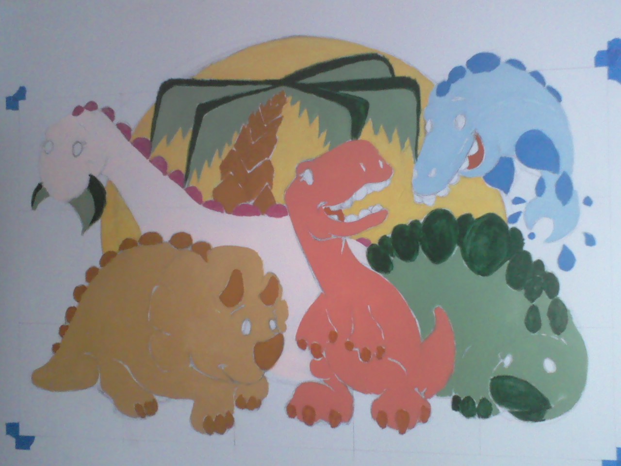
 So I finally started the mural for my brother and his first daughter. My brother and wife wanted dinosaurs, so dinosaurs are what I gave them. It took me about 2 and a half hours to sketch the image on the wall, using a basic graphing method and a lot of stepping back to make sure things were in the right place. I woke up the morning after feeling ready to start painting and with a short trip to the hardware store was able to procure thirteen 2 oz. sample containers of different colored paints, thirteen of foam brushes (for zero cleaning) and some rags for the occasional drip. I was surprised at the number of colors available in those sample selections and found all the colors I needed with no problem. I then went back to my brother's house and got to work.
Here is the first layer of paint where I found out that the yellow and the darker colors (deep green, browns and blue in this case) would take 3 or more coats to look decent. I worked in a way that made it possible to hit those areas as soon as they dried so as not to lose momentum. I still haven't finished but here is the mural as it stands with most of the big areas of color blocked in.

Friday, April 8, 2011

Wednesday, December 22, 2010
Fevre Dream Ilustration

Monday, December 20, 2010
Illustration Friday: Mail
 New style! Decided to go without a preliminary sketch. Turned out okay, I think.
Thursday, June 3, 2010
Daniel Tosh: Fan Art

I think this guy is hilarious. He's honest and can be a little rough sometimes, but his biting sense of humor and wit floor me. Hope you enjoy this bit of illustration.
Monday, January 11, 2010


Subscribe to:
Posts (Atom)